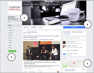
The summer of 2016 has been a little rough for businesses, brands and marketers that use Facebook as an important part of their marketing mix. Not only did Facebook implement a new News Feed algorithm that favors content from users' friends and family, but just over a month ago they rolled out a new desktop business page layout-something they had been testing for a couple of months.
While the algorithm change was a little disheartening, many pages had likely been seeing a drop in organic reach for months as competition for space in the News Feed continued to grow. But when Facebook began testing the new page layout, many page admins were upset for a variety of reasons-from not being told about the changes to hating the new layout to believing they should hold the power to choose a design that works for them.
As someone who's used Facebook for more than six years as a marketing medium, I totally get the frustration. But all the moving, shaking and changing of the digital landscape is nothing new, so we might as well look on the bright side, right?
Here's that bright side:
- The new layout is ad-free, eliminating some of the clutter and potential for your audience to get distracted and navigate away. Basically, you're the start of the show now.
- The profile photo and cover photo no longer overlap, meaning you don't have to design a cover photo to fit around your profile photo now.
- All tabs are visible and stationary as users scroll, allowing you showcase all your information and visual media, and ultimately making it easier for your audience to learn more about you.
- Calls to action are more prominent, giving your audience clear direction on how they can move forward to learn more, get in touch, shop or any other action you're trying to drive.

See? Change isn't so bad, right?
Even if I haven't convinced you, not all is lost. Now that the change is in place, it's time to make sure your page is the best it can be continue to engage users and build awareness for your brand. Below are a few suggestions on how to do just that.
#1 – Assess your profile and cover photo.
Your profile and cover photos are the main visual aspects of your page-and you want them looking good. For the best looking photos, these are the dimensions:
- Cover images should be 828 x 315 pixels
- Profile images should be 180 x 180 pixels
For your profile photo, I'd suggest choosing a branded image or logo. Since your profile photo, along with the tabs, will stay stationary as users scroll through your page this is a great opportunity to keep your brand top-of-mind.
For your cover photo, choose something that can visually convey what you're brand is all about. Since the profile photo no longer overlaps, you have more freedom to be creative. Some text is certainly OK, but don't go overboard. As the old adage goes, a picture is worth 1,000 words.
Here's a great example from FedEx. For me, this cover photo sends the message that FedEx is always there, in the background, reliably delivering packages to locations all over. (And the sunflowers are gorgeous.)

#2 – Consider adding custom tabs.
The ability to create custom tabs isn't new, but the new navigation now allows you to display all tabs. With the old layout, most tabs were hidden under the “More” dropdown on the top navigation bar.
Creating custom tabs does require some tech savviness (and maybe even some web dev experience), but it's worth it. With custom tabs, you're able to connect users with more information about who you are and what value you can bring to them. Consider getting started with tabs for your other social pages such as Twitter or YouTube.
To create the tabs, login to the Apps platform within the Facebook Developer site at https://developers.facebook.com/apps. It may seem daunting, but it's actually a fairly simple process. There are also some third-party tools out there, but using them will most likely require the help of a developer.
Also, keep in mind that you need to be an Admin on the page you're attempting to add the tab to.
For more details, check out Facebook's Page Tabs info page.
#3 – Add content to all your tabs.
With the enhanced navigation, you need to make sure all tabs have content. You certainly don't want users to be met with nothing when they click.
The About section is especially critical. This is where the most basic information about your brand is housed. Make sure it's all there and current.
#4 – Create a username.
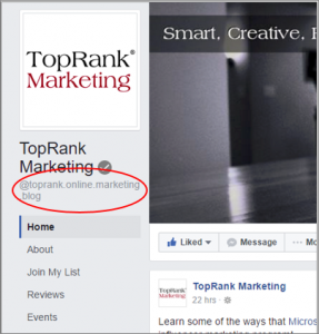
If you don't already have one, create a username for your page. A username will appear in your page's URL, making it more custom, while also making it easier for users to find you in native search results.
With the layout change, that username is now prominently displayed under your profile picture, which can help people remember your page. Check out Facebook's how-to for creating a username.

#5 – Make sure you have the right call to action.
The new layout showcases your call to action button directly under your cover photo, with some nice white space around it. If you don't already have a call to action button, add one. If you do have one, make sure you've selected the right one for telling your audience what they can do next.

#6 – Continue to regularly engage with your audience.
As with any social media platform, the key to success is consistent and relevant engagement. But this goes beyond just posting a link, image or video a few times a week. Put the time in to understand who your audience is, what they're looking and what resonates most with them. Utilize Facebook Insights to see the type of content they're engaging with most and most effective posting times. In addition, consistently review your tactics to see if they continue to be effective for reaching whatever goals you've set forth.
All in all, the new page layout will certainly not be Facebook's last change to its platform. So, make the best of it by adapting your strategies to take advantage of the positive opportunities that change can bring.
What do you like or dislike most about the new layout for Facebook business pages? Tell us in the comments section below.
![]()
Gain a competitive advantage by subscribing to the
TopRank® Online Marketing Newsletter.
© Online Marketing Blog - TopRank®, 2016. |
Find the Bright Side: 6 Things Brands Should Do in Light of New Facebook Page Layout | http://www.toprankblog.com
The post Find the Bright Side: 6 Things Brands Should Do in Light of New Facebook Page Layout appeared first on Online Marketing Blog - TopRank®.
No comments:
Post a Comment